Visualizations are used to display data from your query, in this section we are assuming that you already have a query, following the previous steps.
The supported types of visualizations are:
- Vertical Bar
- Horizontal Bar
- Pie
- Line
- Area
- Scatter
- Mixed
- Number
- Table
Create your first visualization
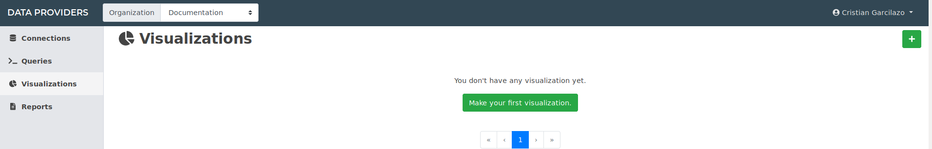
Clicking in the plus sign on the right you can add one visualization.
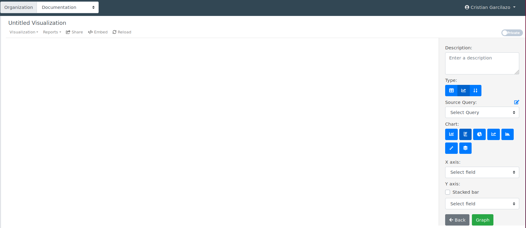
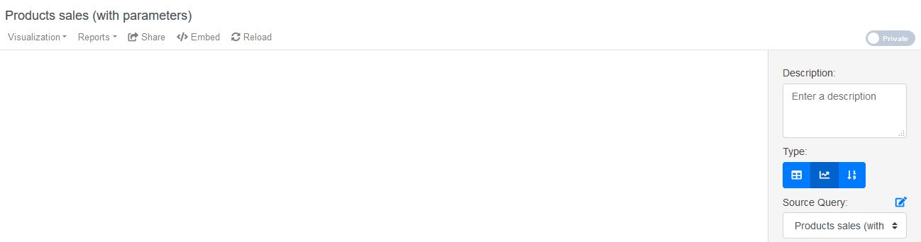
You should define a significant title for your visualization, it will help you find it later
As you can see, we have three different types, “Table”, “Chart” and “Number”, the displayed options will change based on the chosen type.
The first step in every type is to choose the source query, to which you want to create a visualization.
Creating a chart:
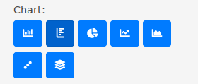
In this case, the options are related to the kind of charts that we actually support, and the possibility to set the corresponding axis .
We are going to use the previous “Products sales” from the Queries section, all you have to do is select it and then choose the corresponding values, based on the specific options for each chart and the data you want to display.
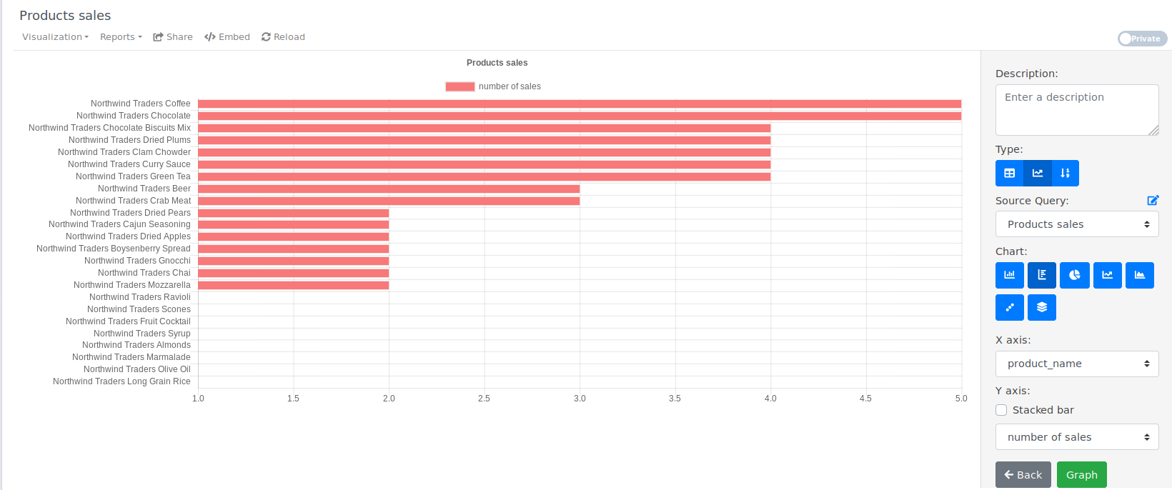
In this example we put “product_name” as de x-axis, “number of sales” as the y-axis and then just click on the “Graph” button, that’s it, with that simple steps you can have your visualization working.
Creating a chart, with parameters:
The key of this example is to have a query with parameters, so we are going to use the “Products sales” query with de “From” and “To” parameters from the previous example in the Queries section. Also you will learn how to create a visualization from an specific query, using the query builder menu.

You can add a new visualization by clicking on “Visualizations” and then selecting the “New” entry, here you also will be able to see the existing visualizations associated to this query, if there is any.
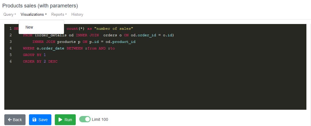
These actions will take you to the visualization builder, in this case with two important changes, in regard to the previous workflow:
- The source query will be the one you came from.
- The visualization title will be as the query.
Like in the first example, the only things that you have to do is select the corresponding axis, the kind of chart and then just press “Graph”, that’s it, you have one visualization with parameters.
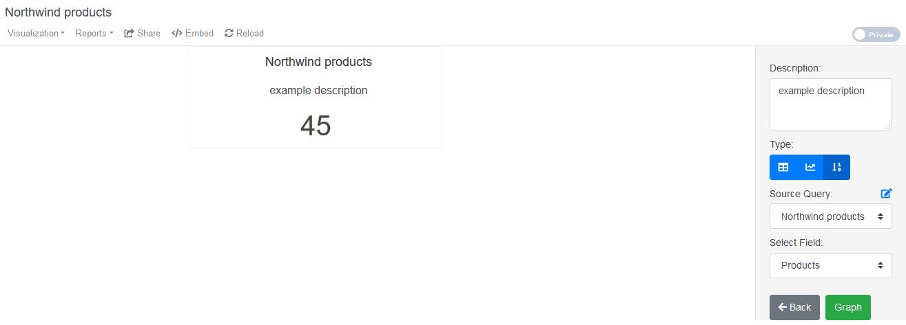
Creating a number
This type of visualization can be used as a KPI indicator and just was made to display an specific number.
The magic behind this visualization is the associated query, in a few words it must be an aggregation over your data, such as SUM, COUNT, AVG, etc., or a simple query with just one important result.
For this example we are going to use a query that returns the total products in our “Northwind” database
SELECT count(*) as "Products" FROM products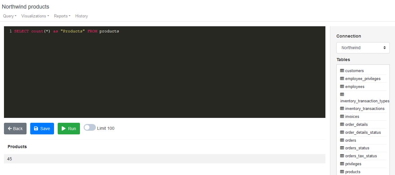
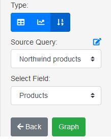
Then in the visualization builder you have to choose the number visualization type, and will see the options, where you have to pick the correct field.
After that simple steps you will have your number ready to use, it might look as the example below.
Creating a table
This type of visualization might be used when you want to display raw data, in this case, any kind of query will serve as source, and the steps are very simple.
We are going to use a query like:
SELECT * FROM productsOver the “Northwind” database.
Then in the visualization builder you have to choose the “Table” type and will see something like this:
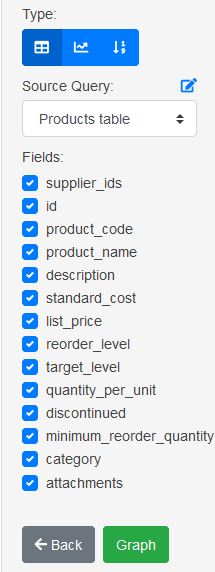
The next step is to choose the fields that you want to display and press “Graph”.
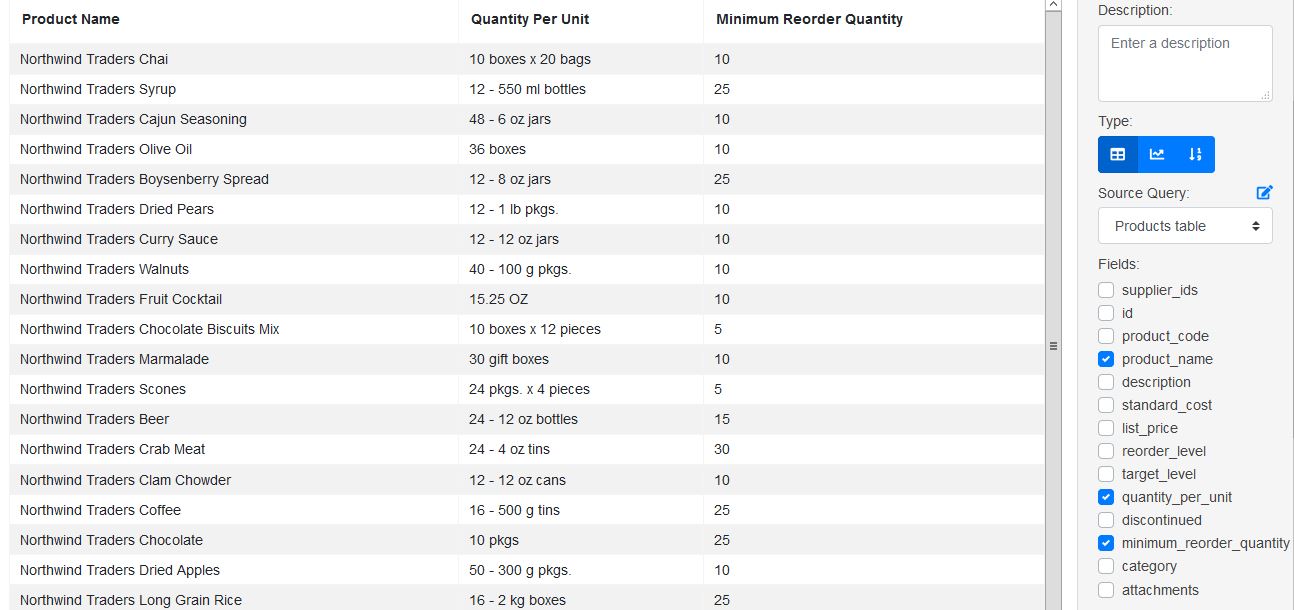
For this example we choose the “product_name”, “quantity_per_unit” and “minimum_reorder_quantity” fields, and that’s it, you have a table ready to use.
Resume
In this section we teach you about how to create visualizations like charts, numbers and tables using two workflows.
The important key is to have the right query with all the data that you want to display.
Don’t use a query with a lot of results, because the chart might turn incomprehensible.